Funnels
9 min read
The Anatomy of a B2B Confirmation Page
After they book, the prospect starts asking “did I make a smart call?” — and they research you whether you like it or not. Here's how to make that research happen inside your funnel, on a page you control.

Two things to learn here: how to make prospects binge your confirmation page like it’s Netflix, and how to turn the lead who just booked into an active researcher.
The One Mental Model
After they book, the prospect starts asking “did I make a smart call?”
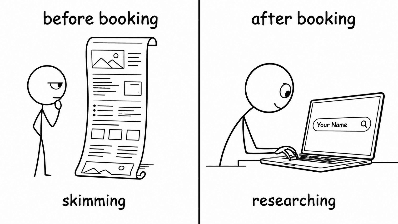
Before the booking, attention is rationed. The prospect hasn’t committed to caring about you yet — they’re skimming, not reading; judging, not learning. That’s why your VSL has to do all the lifting before the form. Then they book, and everything switches. There’s a call on the calendar now. Money or time is about to be spent. Their brain stops asking “should I do this?” and starts asking “did I make a smart call?”
So they research. They Google your name and company with “reviews.” They ask AI about you. They check your LinkedIn. They hover over the cancel button on the calendar invite. Every prospect does this — nobody tells you. The only question is whether they do that research inside your funnel or outside it. Outside, you’ve handed control to Google and AI. Inside, your confirmation page becomes the most controlled environment in your entire funnel.
The Positioning Problem
Everyone tells you to put a thank-you video on the page. They’re right — you should. The problem is nobody goes through it. Even with a follow-up email pointing at it. Even with an SMS from your setter. Even with a bright orange arrow on the play button. The reason is positioning: the prospect has no reason to watch your videos. You’re asking them to consume more after they already gave you the conversion event. In their head, the funnel is done — the calendar invite is the receipt.
The fix is to reframe the page from “here’s what you booked” to “here’s how to figure out whether this call is even worth your time.” That flip changes everything. Now they have a reason. They can self-disqualify. They can walk in already half-convinced, with sharper questions instead of vague curiosity.
A B2B agency we recently came across runs exactly this reframe. They changed a single line from “watch these videos before our call” to “go through this page first. If any of these answers don’t sit right, cancel the call and save us both time.” Their show rate moved from around 53% to around 71%. Same videos, same page, one line.
The Front-and-Center Video
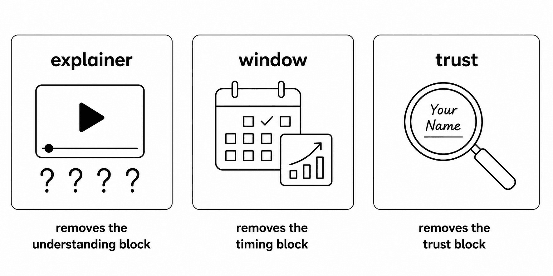
The first video is the most important asset on the page — it loads largest, sits in the centre, and sets the tone for everything below it. Most B2B funnels put a logistics video there: “Hey, thanks for booking, you’ll get a calendar invite, make sure you show up on time.” Dead on arrival. The prospect arrives with one of three blocks: they don’t understand the offer, they don’t feel a reason to act now, or they don’t trust you yet. The opening video removes whichever block applies. Three formats, one job each:
The explainer opener (removes the understanding block)
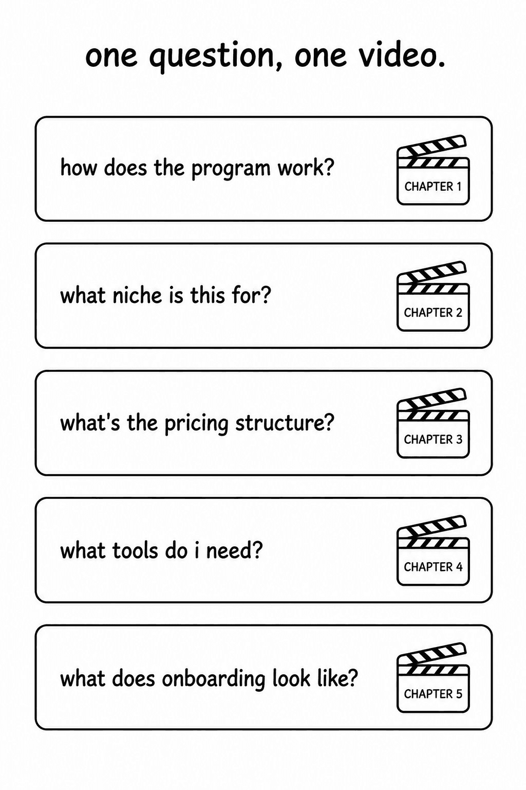
A 2–3 minute video answering the top 4–6 questions that come up on every sales call. Not a list — a conversation, one question per chapter, with chapter markers so the prospect can scrub to the one they care about. Structure each video the same way: a 60-second summary at the top, the deep-dive after. The skimmer gets the answer in 60 seconds; the researcher stays for the full three minutes. One asset, both behaviours served.
The window opener (removes the timing block)
Instead of answering questions, this video creates a real reason to act now. The reason can’t be artificial — “book before Friday or the price goes up” stopped working years ago, and sophisticated buyers see through it instantly. Real urgency comes from third-party data: market shifts, regulatory changes, opportunity windows that close on their own.
The trust opener (removes the trust block)
Almost nobody runs this one, and it works the hardest. The framing is direct: “You’re about to spend an hour with us. Let me help you figure out whether we’re worth it.” Then the video walks them through how to research you — show your dispute rate, your refund rate, tell them to Google your name with the word “scam,” and walk them through what they’ll find. It sounds insane to pre-empt your own negative search results. That’s exactly why it works: the prospect feels like an adult being handed information instead of a mark being herded into a sale.
The Question Stack
Below the front-and-center video sits a stack of shorter, narrower videos — one per question, each with chapter markers, each opening with a 60-second summary. That last rule is the most ignored and the most important: the summary serves the skimmer, the deep-dive serves the researcher, one asset for both.
Where do the questions come from? Two places. First, your sales-call transcripts — the top 5–7 questions that come up in every call become your top 5–7 videos. (Use AI to extract them: drop 10–15 transcripts into a project and prompt for the most common questions and objections ranked by frequency.) Stack the most common at the top, less common further down.
A single founder we’ve seen running an info offer added five question videos to his confirmation page — no other changes — and show rate went from around 41% to around 69%. That’s the higher end of what one change does, but it’s not unusual. The stack works because it collapses the research phase into a single page you control. Every minute the prospect spends there is a minute they’re not spending in someone else’s narrative.
The Setter Move
The page does most of the work on its own. One tactic doubles its impact: your setter — the person confirming the call over SMS or WhatsApp — should screenshot one specific video card and send it directly. Not the page link. Not “check out the resource page.” An actual screenshot, with a message like:
“Hey [name], saw on your application you mentioned [specific problem]. There’s a video on the resource page that addresses this directly — second one down. Worth watching before the call; it’ll save us ten minutes up front so we can get to the strategy faster.”
Three things happen at once: the prospect feels seen (you referenced their application), the request feels custom (one video, not “go watch this page”), and the cost of compliance is low (four minutes, not forty). They walk into the call already half-educated on the specific objection the video addressed. The call doesn’t start at zero — it starts at minute ten.
The Proof Stack and the Static Number
Below the videos goes a wall of testimonials — not three, not five, as many as you have. Design for both the reader and the skimmer: the reader clicks into individual screenshots and finds the one that mirrors their situation, while the skimmer scrolls past and registers the sheer volume. Bias toward volume; the mass is the proof. Use clickable image testimonials, check mobile rendering, and reserve video testimonials for a separate section so they don’t pull attention from the front-and-center video.
One detail most teams skip: the phone number your setter texts from should also appear somewhere on the confirmation page. The prospect, now in research mode, sees the same number on the page that’s in their text thread. That congruence is small but powerful — it signals the team they’re about to talk to is the same team that built the page they just consumed.
The Test
Read your confirmation page top to bottom. After each video card and section, ask one question: what question in the prospect’s mind did this answer? If you can’t answer it, it’s filler — cut it. Then ask what they’d look for next, because the next section should make them feel like they never needed to leave the page to find it. Keep going until the only thing left to do is show up to the call.
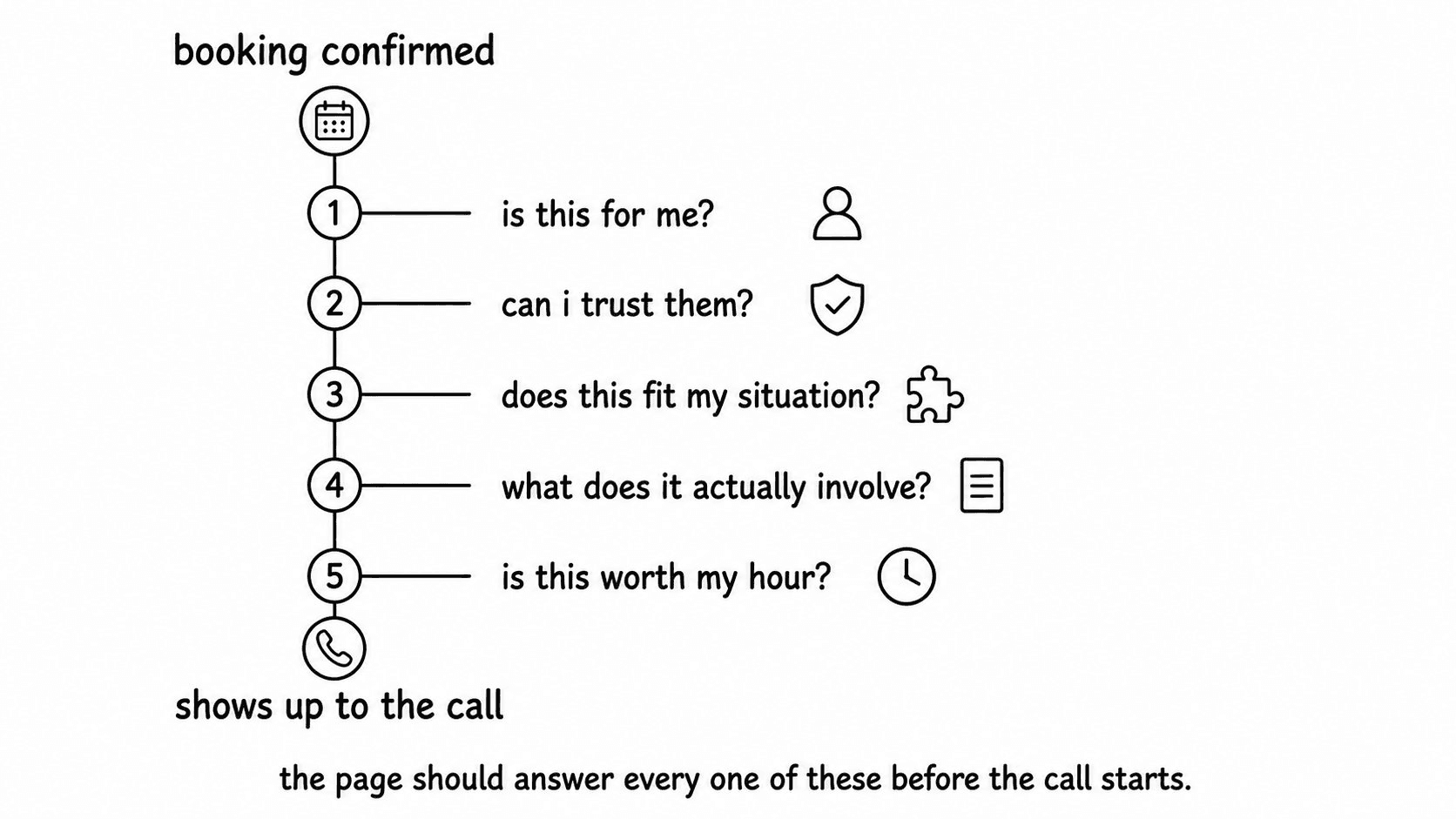
Your confirmation page isn’t a thank-you screen. It’s the only environment in your entire funnel where the prospect actively wants to consume what you put in front of them. Build it right and the call gets shorter, sharper, and easier to close. To see how it fits the full funnel, read our breakdown of the cold-acquisition engine for referral-only agencies.
Want to see how this page could look for your offer? Book a call and we’ll map it out.
Want this built for your offer?
We build done-for-you cold-traffic funnels for B2B agencies — landing page, VSL, ads, and nurture in 14 days.
Book a free call